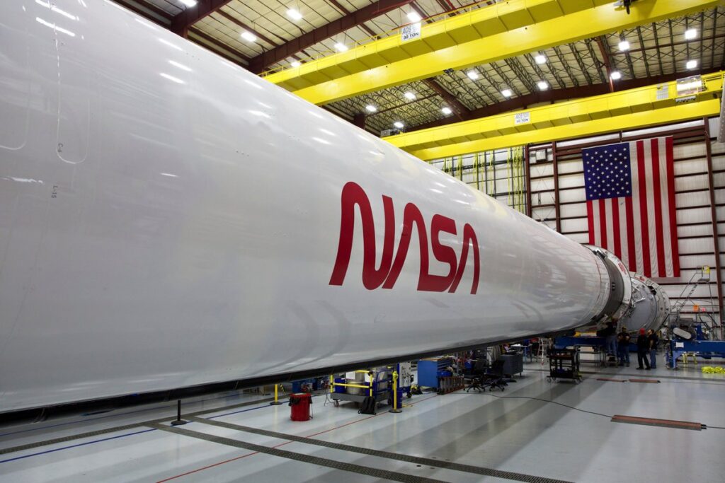
Yes, that’s right. The classic NASA “worm” logo is back! An image of the revived NASA worm logo was released on Twitter by NASA Administrator Jim Bridenstine as well as press release on the NASA.gov website.
NASA explained that original NASA insignia is an iconic symbol widely recognized in the world. The NASA “meatball” logo as many know it by represented patriotic American colors. A red chevron wing piercing a blue sphere(Planet) with white stars, and an spacecraft orbiting. This “meatball” logo was not easy to reproduce with 1970’s technology so the Federal Design Improvement Program introduced in 1975 a new logo, the “worm.”
Some History about the logo
By the beginning of World War I, the United States lagged behind Europe in airplane technology. On March 3, 1915, Congress founded NACA as an independent government agency in response to the perception that the United States was falling behind in aeronautical technology. NACA would report directly to the President with the purpose to catch up. But technology had evolved, and once again the US was falling behind in technology. Russia launched Sputnik. The space race was being lost.

Following the launch of Sputnik, the United States created NASA to catch up in the space race and pull ahead. In order to help spur on a wave of national enthusiasm in support of the nation’s aeronautical, a logo would be needed. The new agency set out to design a new logo and came up with various options for consideration.

The red emblem contained on the NASA logo, has erroneously been referred to as a “slash,” “vector,” “airfoil,” “hypersonic wing design,” and even as an “alternate shape of the constellation
Andromeda.” It was based on a wooden model for an arrow-wing design.

The official NASA seal was submitted with the “Meatball” .….
Read more on West East Space…
