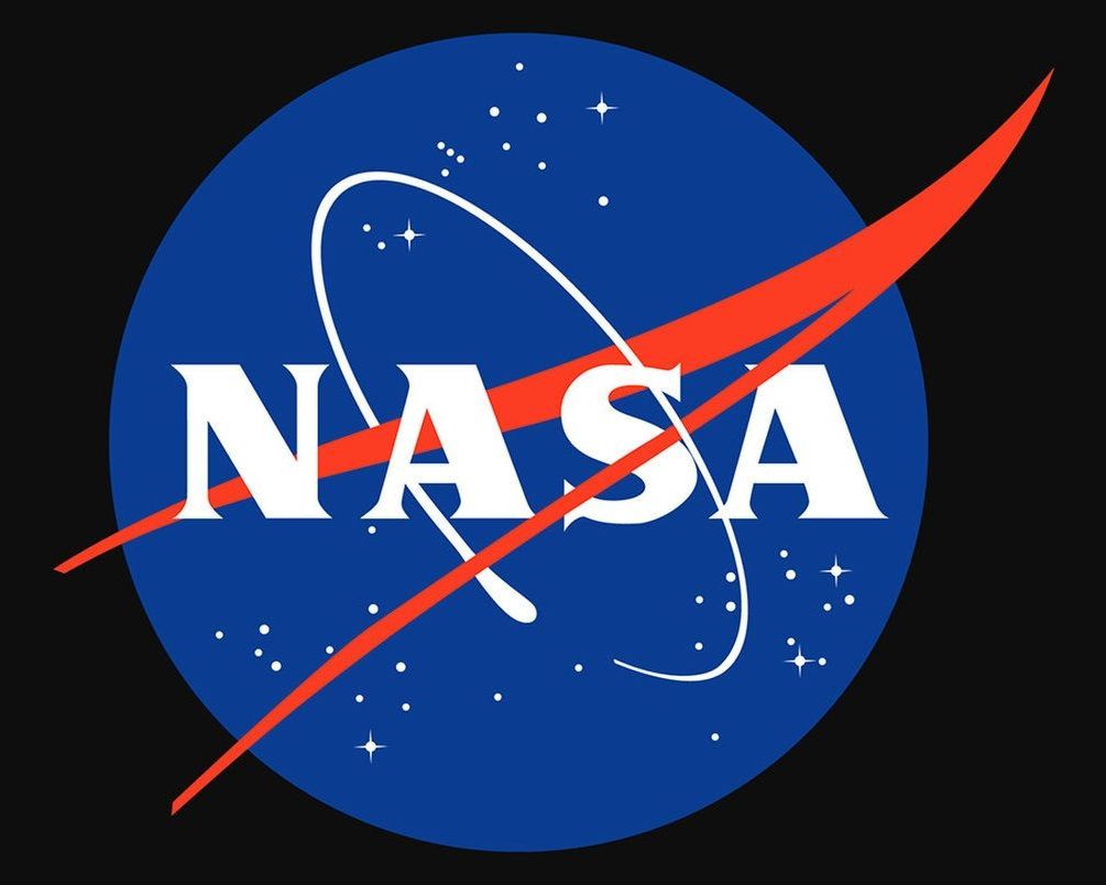
Do you think NASA needs a new logo?
Michael D. Shaw is a biochemist and freelance writer. A graduate of the University of California, Los Angeles, and a protégé of the late Willard Libby, winner of the 1960 Nobel Prize in chemistry, Shaw also did postgraduate work at MIT. Based in Virginia, he covers technology, health care and entrepreneurship, among other issues.
NASA’s logo needs a refresh. The agency’s official logo, the 59-year-old “meatball insignia,” features a sphere to represent a planet, stars to represent space and a red chevron or “wing” to represent aeronautics, with white N-A-S-A lettering in the center. This logo looks like it belongs in a museum, commemorating the past, not celebrating the future. As NASA celebrates its 60th anniversary this year, this seems like a good time for the agency to update its antiquated logo.
